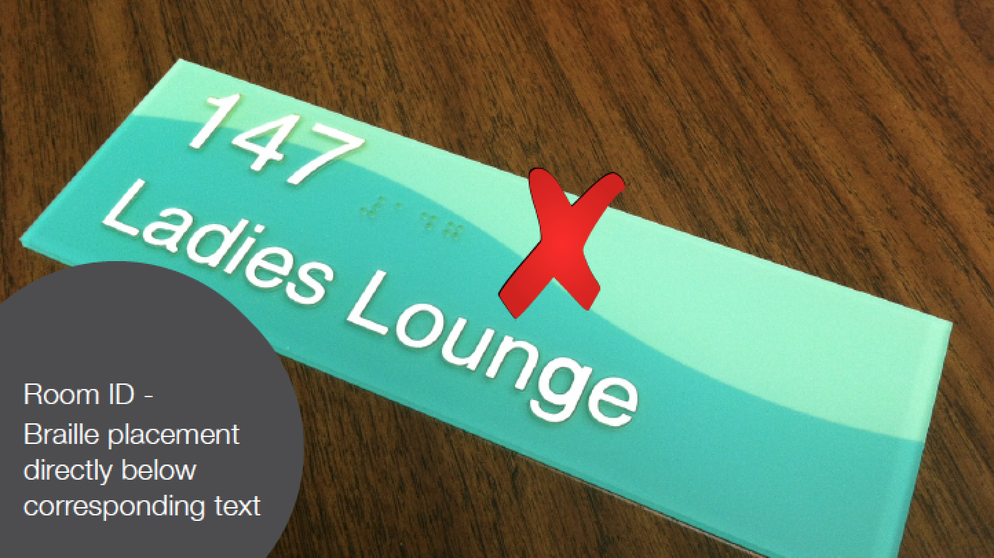
5 Reasons Your Signs Are Not ADA Compliant
ADA signs are designed, specified, and fabricated everyday. Some are done the right way and well, others are not. Indeed, there are a few key aspects that all ADA signs must comply with and a few simple rules that must be followed.
ADA signs are designed, specified, and fabricated everyday. Some are done the right way and well, others are not. The truth is that the guidelines for ADA signs are not that complicated. There are a few key aspects that all ADA signs must comply with and a few simple rules that must be followed.
The problems we see with non-compliant signs comes from one of two things. The first is a lack of knowledge and the second is simply ignoring the guidelines to meet a specific design ascetic.
Last year, I wrote a post on the increased penalties for ADA violations. The penalty for the first violation is $75,000 with each additional offense being $150,000, real money for sure. As a sign architect or designer, you have the obligation to make sure the work you’re producing meets the ADA guideline because it’s the law for starters and because you’re creating work that makes the built environment more accessible to people with visual disabilities.
Here are five common things wrong with ADA signs. There are others, but these five touch on the main areas.
1. Font: A Nasty 4‑Letter Word
The word font can be one of the nastiest four letter words when it comes to design. I’m not sure why so many people ignore the fact that the tactile on ADA signs should be San Serif or the fact that the character size is regulated. The language in the 2010 Standard for Accessible Design is very straight forward.
703.2.2 Case. Characters shall be uppercase. 703.2.3 Style. Characters shall be sans serif. Characters shall not be italic, oblique, script, highly decorative, or of other unusual forms. 703.2.4 Character Proportions. Characters shall be selected from fonts where the width of the uppercase letter “O” is 55 percent minimum and 110 percent maximum of the height of the uppercase letter “I”. 703.2.5 Character Height. Character height measured vertically from the baseline of the character shall be 5⁄8 inch (16 mm) minimum and 2 inches (51 mm) maximum based on the height of the uppercase letter “I”.
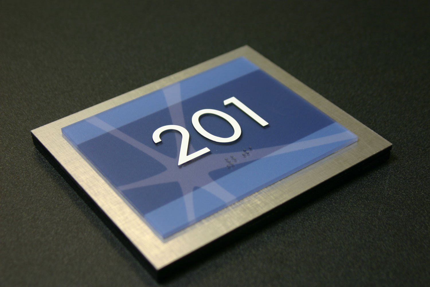
Not everyone wants to use Helvetica for everything. I get it, although I personally like Helvetica. There are so many other ways to make your signs decorative with the use of color, shape, materials, etc. There’s also the option to create Dual Message signs where you can have the tactile blend in with the background as long as the same message is above contrasting with the background. This scenario allows you to use Serif fonts for the visual message.
703.1 General. Signs shall comply with 703. Where both visual and tactile characters are required, either one sign with both visual and tactile characters, or two separate signs, one with visual, and one with tactile characters, shall be provided.
There are several Exemptions in the code that refer to the requirement for Dual Message Signs. Read more.
2. KERNING: Do Those Letters Look Funny?
Kerning may possibly be the most hated part of the ADA. The new 2010 Standard says there needs to be a minimum of 1÷8” between the two closets points of any tactile characters.
703.2.7 Character Spacing. Character spacing shall be measured between the two closest points of adjacent raised characters within a message, excluding word spaces. Where characters have rectangular cross sections, spacing between individual raised characters shall be 1⁄8 inch (3.2 mm) minimum and 4 times the raised character stroke width maximum. Where characters have other cross sections, spacing between individual raised characters shall be 1⁄16 inch (1.6 mm) minimum and 4 times the raised character stroke width maximum at the base of the cross sections, and 1⁄8 inch (3.2 mm) minimum and 4 times the raised character stroke width maximum at the top of the cross sections. Characters shall be separated from raised borders and decorative elements 3⁄8 inch (9.5 mm) minimum.
When you think about it, this is pretty simple. The tricky thing is that some character pairs are naturally closer together meaning that in order to be ADA compliant, the character sets need to be spaced further apart than normal which makes the character spacing appear wrong at times.
The 1÷8” kerning minimum also makes words long and causes issues with the size of the sign. The simple solution in a situation like this would be to squeeze everything together to make the word fit on the sign. This of course is not compliant and makes tracing the letters with your fingers very difficult.
If you think about it, tactile is required so people with visual disabilities can trace their fingers along the tactile to read the name of the room. The number of people that can actually read Grade II Braille is low thus the requirement for tactile.
3. CHARACTER SIZE: Too Big or Too Small
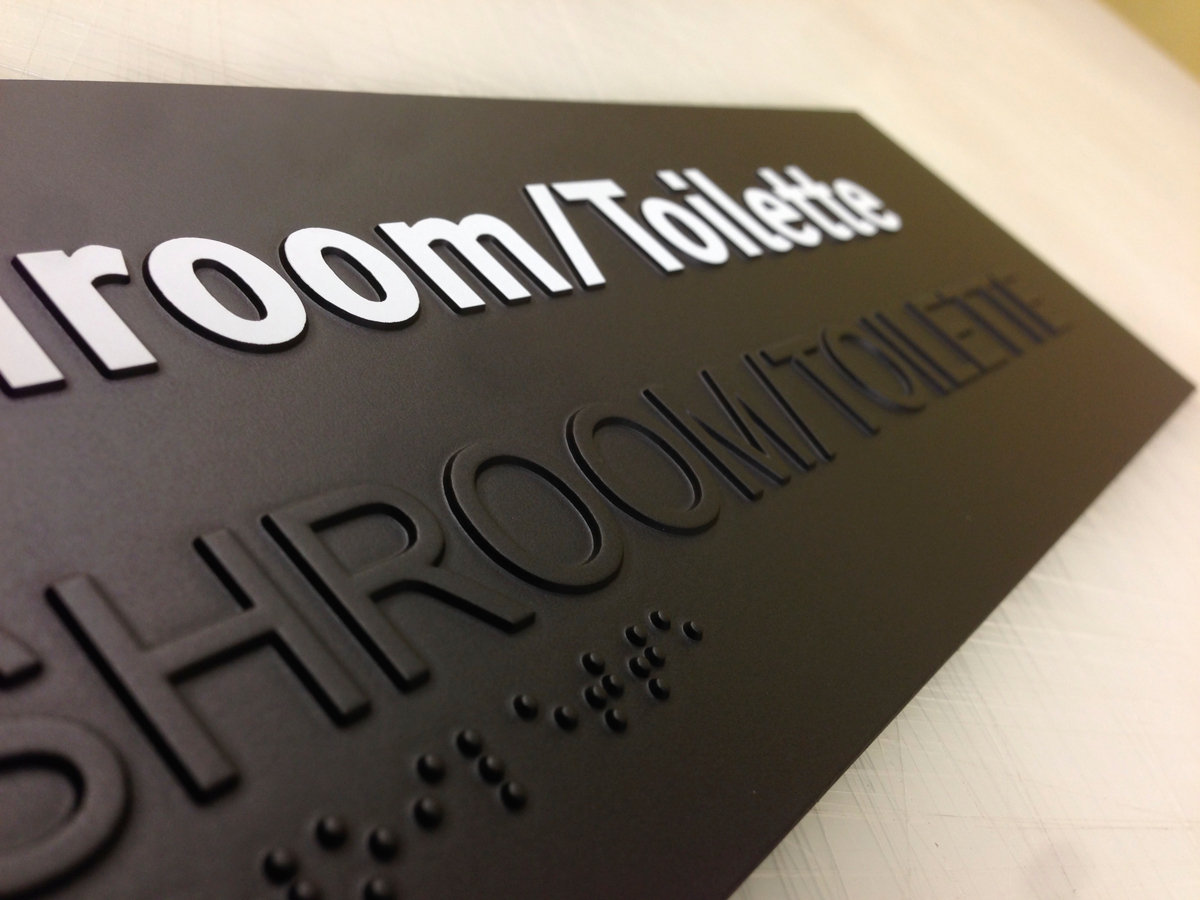
The size of tactile is simple. The minimum height is 5÷8” and the maximum is 2”. Pretty simple and not much room for interpretation. We often see this rule broke when the design doesn’t allow enough room for compliant Braille and tactile. This also happens a lot with certain frame systems.
703.2.5 Character Height. Character height measured vertically from the baseline of the character shall be 5⁄8 inch (16 mm) minimum and 2 inches (51 mm) maximum based on the height of the uppercase letter “I”.
The exception to this rule is with the Dual Message Sign. In this case, the tactile is allowed to be as small as 1÷2”.
EXCEPTION:Where separate raised and visual characters with the same information are provided, raised character height shall be permitted to be ½ inch (13 mm) minimum.
4. BRAILLE: Is That Compliant?
There are many different ways to manufacture Braille signs and yes, you can make compliant Braille with all the fabrication methods. The 2010 Standard has a few specific codes relating to Braille which include the structure of the dot, the cell spacing and placement.
The verbiage regarding the shape of the Braille is very specific. The language is not written to include or exclude any materials. The language is a guideline for the shape and size of each Braille dot and cell.
703.3.1 Dimensions and Capitalization. Braille dots shall have a domed or rounded shape and shall comply with Table 703.3.1.
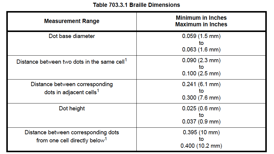
In the US, signs are required to have Grade II Braille which incorporates 189 contractions and short form words. The condensed size of the Braille is ideal for the limited space available on most signs.
Title 24 in California uses different spacing for Braille. California Braille, as it’s commonly called, still uses Grade II Braille but the spacing between the Braille cells is farther apart.
The other main difference with Title 24 is the placement of the Braille. Both the 2010 Standard and Title 24 require the Braille to be a minimum of 3÷8” directly below the corresponding text. Title 24 however sets a maximum distance if 1÷2”. Both require the Braille to be directly below so no, you cannot put the Braille on the right side of the text no matter what.
The uppercase indicator before Braille is not often required, but since many people are not sure when to use it, we see it used frequently. The codes states that “The indication of an uppercase letter or letters shall only be used before the first word of sentences, proper nouns and names, individual letters of the alphabet, initials, and acronyms.”
5. MOUNTING: Is That Sign Too Low?
The 2010 Standard changed the mounting requirements for ADA signs. There is now a variance of 48″ to 60”. An important thing to note is that the mounting height of the sign is base on the height of the tactile characters above the finished floor. This means that the flooring needs to be factored in when determining the placement of the signs.
The code spells out most of the mounting scenarios in details. If you ever have a situation where you’re uncertain the correct location to mount an ADA sign, you should ask the local building inspector. Unfortunately as many of you know, different people have different interpretations of the codes, especially when it comes to mounting location.
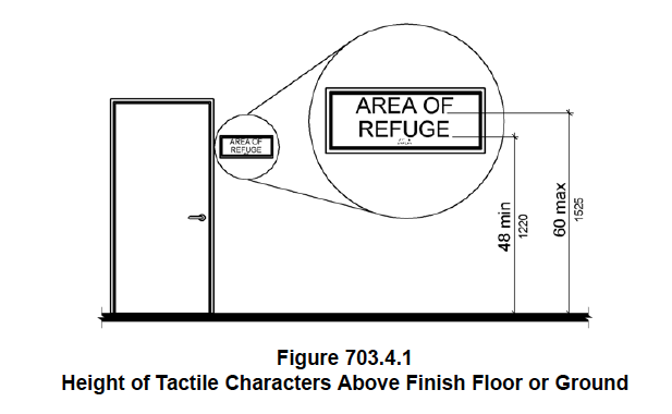
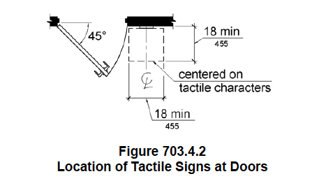
703.4.1 Height Above Finish Floor or Ground. Tactile characters on signs shall be located 48 inches (1220 mm) minimum above the finish floor or ground surface, measured from the baseline of the lowest tactile character and 60 inches (1525 mm) maximum above the finish floor or ground surface, measured from the baseline of the highest tactile character. EXCEPTION:Tactile characters for elevator car controls shall not be required to comply with 703.4.1. 703.4.2 Location. Where a tactile sign is provided at a door, the sign shall be located alongside the door at the latch side. Where a tactile sign is provided at double doors with one active leaf, the sign shall be located on the inactive leaf. Where a tactile sign is provided at double doors with two active leafs, the sign shall be located to the right of the right hand door. Where there is no wall space at the latch side of a single door or at the right side of double doors, signs shall be located on the nearest adjacent wall. Signs containing tactile characters shall be located so that a clear floor space of 18 inches (455 mm) minimum by 18 inches (455 mm) minimum, centered on the tactile characters, is provided beyond the arc of any door swing between the closed position and 45 degree open position. EXCEPTION:Signs with tactile characters shall be permitted on the push side of doors with closers and without hold-open devices.
This post originally appeared on Nova Polymers’ blog and is written by Mike Santos, Marketing Director for Nova Polymers.
Like what you see?
Get more ideas, design, and inspiration delivered to your inbox on a monthly basis. Sign up for our email, we won’t waste your time!