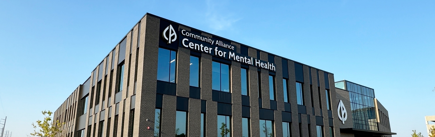
Providing Care and Comfort: Exterior Signage at Community Alliance
This healthcare organization in Omaha, Nebraska, offers psychiatric care, counseling, primary care, and other support services. Its new 127,700-square-foot facility can hold up to three times the number of people it serves in its existing facilities.
Creating Timeless Yet Bold Signs for a Mental Health Facility
Community Alliance is a healthcare organization in Omaha, Nebraska, that offers psychiatric care, counseling, primary care, and other support services. During the pandemic, the organization saw a rapidly growing need for mental healthcare, so they built a 127,700-square-foot facility that would serve up to three times the number of people their existing facilities could hold.
The new building opened in June 2024 with Latitude Signage + Design signage adding timeless style and branding to the facility. Here’s a video from KMTV showing the new facility.
Signage Needs
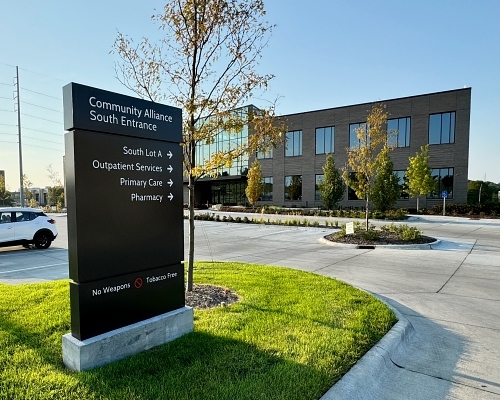
The new Community Alliance building has multiple entrances over an expansive property. Clear, communicative wayfinding signage was crucial in providing a comfortable, efficient experience for patients, employees, and visitors.
Rainwood Development Partners came to us for help with this signage project. The architect, Alley Poyner Macchietto Architecture (APMA), had a concept in mind that we brought to life by designing, manufacturing, and installing the exterior signs.
Well Balanced Sign Design
A soft, timeless look was key for sign design success. The signs needed to be large to help people easily find their way, but we didn’t want them look too overwhelming.
“We wanted to reassure people when they arrived at Community Alliance,” said Rebecca Kleine, the project’s business development manager. “We wanted to give a welcoming feel that wasn’t too loud or in your face.”
Our goal was to use all the square footage available at Community Alliance to not only build a cohesive visual brand, but also provide campus navigation so people could always tell where they were and where they needed to go. Each entrance is clearly labeled with an easy-to-read sign, and other helpful wayfinding signage is prevalent throughout the campus.
The Logistics
It was important for the signage to be visible in all directions. A key component of this business was being highly accessible to all, so this major intersection had fast-moving traffic, which needed consideration with the signage sizing. To ensure people didn’t miss the building, we helped design an oversized main monument sign to attract attention and be visible from the street.
The beautiful Community Alliance building is brick with inset metal panels. The oversized raceway behind channel letters minimized mechanical and electrical penetrations into the building, helping maintain its aesthetics.
The slightly curved sign design with push-through acrylic fit well with the building’s classic understated exterior. The sans serif font Community Alliance’s branding agency chose worked perfectly for the oversized signs.
The result? A sleek, sophisticated campus that’s inviting, comforting, and easy to navigate. Learn more here.
Have questions about this project? Connect with our signage expert on this project, Rebecca Kleine.
Connect Today for any questions on incorporating creative signage solutions in your building project.
Learn more about healthcare signage here.
Like what you see?
Get more ideas, design, and inspiration delivered to your inbox on a monthly basis. Sign up for our email, we won’t waste your time!