From Boring to Brilliant: 3 Ways to Gussy Up ADA Signage
ADA Signage may be the most basic or “vanilla” of signs. Here a few of our designers share their favorite ways to enhance even the most basic of ADA signs.
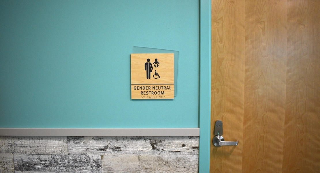
1.Use light to provide design: Clear acrylics add dimension to ADA Signage.
By using a thicker acrylic with polished edges and painting the back of the sign, light is able to come through the sides and provide dimension. Applied ADA lettering casts a shadow partnered with the back paint (aka subsurface or 2nd surface) and the thicker the acrylic the more the shadow. It’s a classy touch that works well with matte or satin finish which are needed to meet ADA Guidelines.
Bruce Leasure, Designer
2.Back that thing up: Add a backer to an ADA Sign.
Adding a backer can give some uniqueness and it’s a great way to tie in design elements throughout a facility. From an architectural shape present in the design to a unique color or pattern to help the sign pop, or compliment the design.
Ashley LaRue, Designer
3.Unique materials add to great design: Interesting graphics, panels, or laminate can do a lot.
Graphics themselves have come so far in just the last few years. Designing and printing custom backgrounds make both for an interesting sign and tie in with the overall facility design. Laminates are also very versatile and plentiful in options. Use laminates for the backer, the sign, or a simple accent and goes a long way in adding just the right amount of spiff to the sign. Photopolymer that uses 3Form designs is always a solid option. New to the mix are wrapped laminates called “foils” that give the sign texture with a finished edge. These are all great ways to gussy up a simple ADA sign.
Terri Leedom, Designer
Where to Start?
There are millions of options for great ADA Signage. Most importantly is to work with a trusted partner who is an expert in ADA guidelines and the parameters around acceptable design, accessibility, and proper installation.
Want to learn more about options for ADA Signage or see some samples? Find a sign expert that can help you do just that.
More on ADA:
Like what you see?
Get more ideas, design, and inspiration delivered to your inbox on a monthly basis. Sign up for our email, we won’t waste your time!