Our Favorite Signs from 2017
February 2018
In the Colorado, Nebraska, Iowa, and Illinois territories we really had some fun in 2017. We'd like to share just a few of our favorite signs from last year. We're very grateful and thankful to have such wonderful clients that allow us to create, build, and install their signage at their facilities. While we couldn't share ALL of our favorites, we hope you enjoy and maybe even get a little inspiration from a few of these.
And, in no particular order, here are Our Favorite Signs from last year:
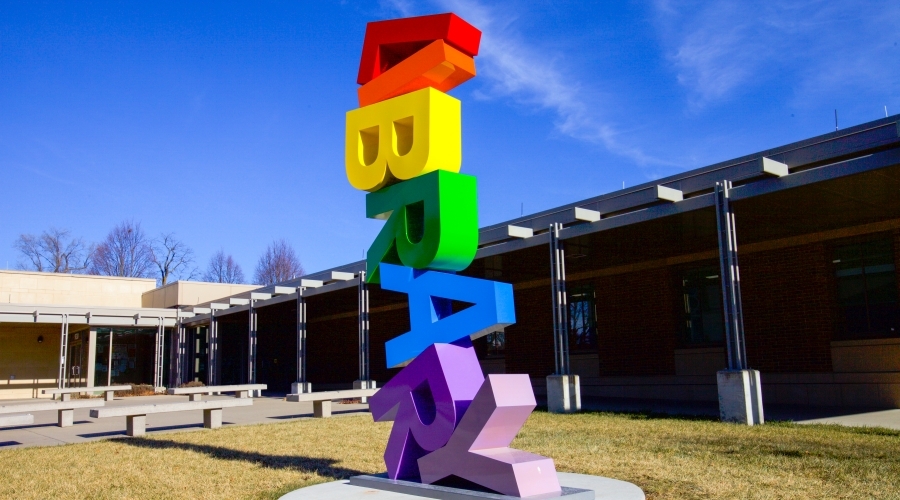
The Drake Community Library - Exterior Sign in Grinnell, IA
Why it's a favorite? Because this is the perfect combination of sculpture meets architectural signage. This all aluminum one-of-a-kind rainbow beauty was a collaboration of local artist Ryan McGuire, the library, and our production design and manufacturing team.
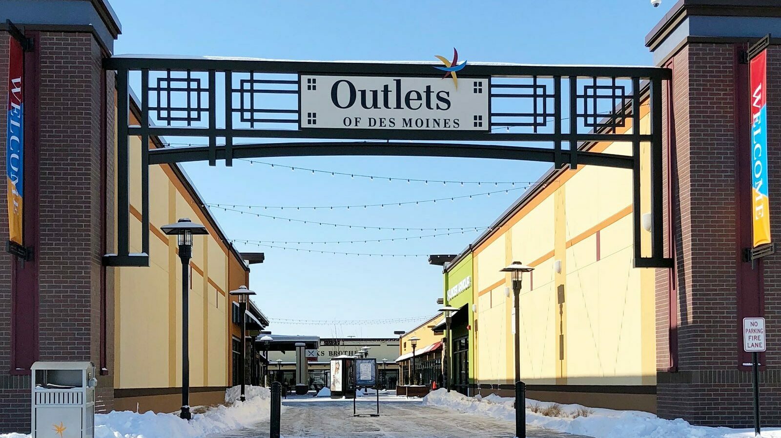
Outlets of Des Moines - Truss Signs in Altoona, IA
Why it's a favorite? Who doesn't enjoy the "craftsmen style?" The design carries through the entire outdoor shopping mall and it all begins with these three truss entrance signs. The behemoth truss signs were fabricated in our factory in Grinnell and then a lift dropped them into place as one large piece (3 times). Design, fabrication, and install collaboration at it's finest.
Air Force Academy - Digitally-Printed Silicone-Edged Graphic Walls in Colorado Springs, CO
Why it's a favorite? This SEG fabric technology takes environmental graphics to another level. More economical and dynamic than vinyl wall covering, this product is stretched across an aluminum retainer system AND was a breeze to install and is updateable. These graphics transformed the hallways at the Air Force Academy.
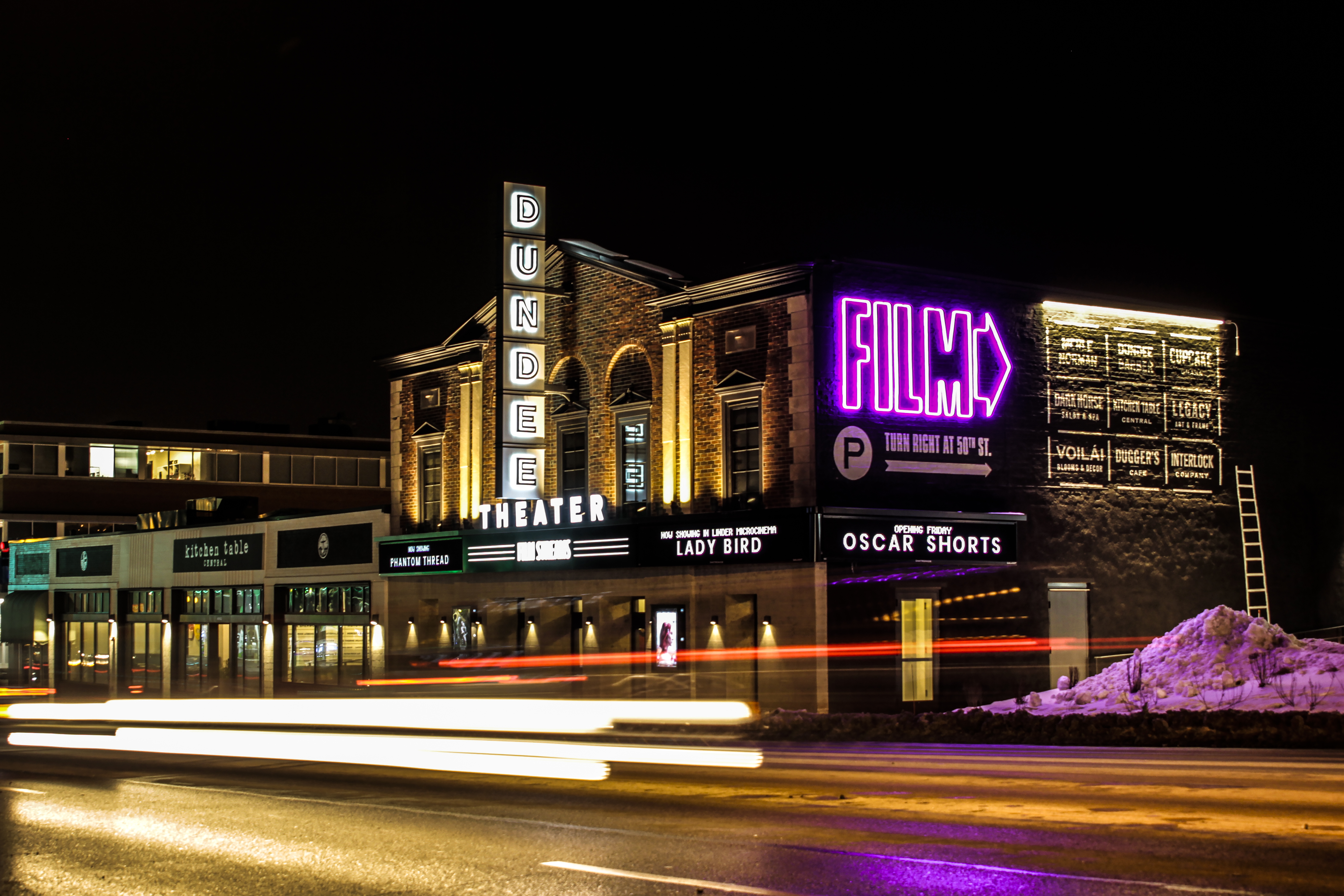
Dundee Theatre - Exterior Signage in Omaha, NE
Why it's a favorite? Helping renovate a historic project, especially a theatre is an extra special treat. Re-creating the main marquee signage with a historical feel and installing into the side of historic building all have their challenges. But what's really cool is the "neon" "FILM" letters. Why? Because they're not really neon, it's LEDs! We're thrilled with how this turned out and utilized a relatively new flexible LED product to give the "vintage" look of neon.
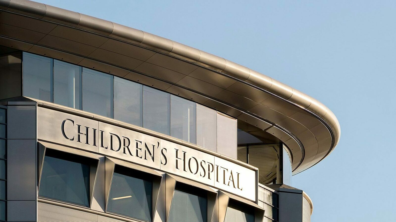
University of Iowa Stead Family Children's Hospital - Exterior Signage in Iowa City, IA
Why it's a favorite? Because of the seamless design. The design intent was for the lettering to look like an etched letter into the building. Collaborating with Foster + Partners on the design and fabrication, these routed aluminum curved signs have controllable LED illumination, open face construction and live 12 stories in the air. They also have a great view of all University of Iowa football games.
Photo courtesy of Foster + Partners
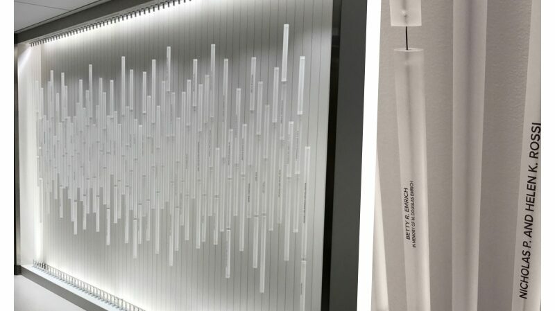
University of Iowa Hospitals and Clinics - Heart & Vascular Donor Wall in Iowa City, IA
Why it's a favorite? It's the first of its kind! Donor names on the vertical, who would've thought? This design replicates an EKG reading and the tubes are custom designed and laser engraved with names on the vertical. The cable suspension system and tubular design are out of this world.
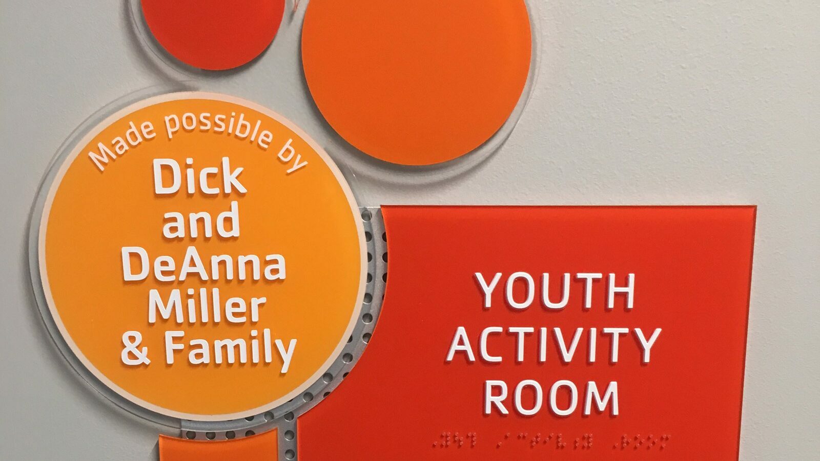
Charles E. Lakin YMCA - Room sign, Omaha, NE
Why it's a favorite? Who knew ADA room signs could be so fun, thoughtful, and modular? Circular signage is nothing new, but to pull the circles throughout the facility, including the donor wall (more to come) and add such fun color tones to each sign. This specific sign honors a wife and her love of children, you can read more here.
Lastly, you'll see that funky perforated backer the panels are clinging to. Similar to a lego board, parts and pieces can be interchanged if needed in the future.
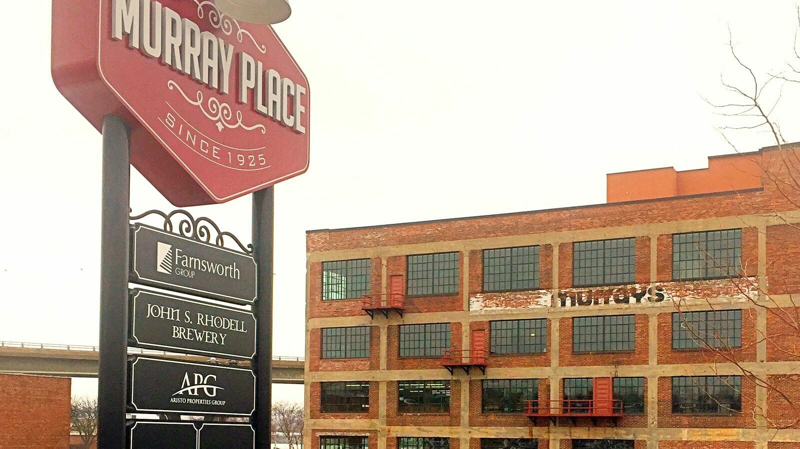
Murray Place - Main Identification Sign, Peoria, IL
Why it's a favorite? This 90 year-old warehouse, on the Peoria riverfront in the Peoria Warehouse District, was recently converted into a mixed-use commercial and residential facility by the Murray family and Aristo Properties. The strict guidelines to keep the district as authentic as possible led us to design this sign that captured the 1920's era from when the building was constructed. The sign itself is exterior illuminated with a gooseneck light fixture and features panels for multiple tenants with room for growth.
Like what you see?
Get more ideas, design, and inspiration delivered to your inbox on a monthly basis. Sign up for our email, we won’t waste your time!