6 Tips to Wayfinding Signage Success
What is Wayfinding Signage?
Simply said, wayfinding signage are the signs that tell you where to go. They help you to orient yourself, plan and follow a route to find specific buildings, departments, parking lots, restrooms, and places of interest.
But developing a wayfinding system is not so simple. There is a science to directing people to their desired destination. It must be simple, clear, and placed in the appropriate location.
Our Design-Build process brings the project team to the table with a common goal; the right sign in the right location, right on budget so people can get where they're going.
6 Tips for Wayfinding Signage Success
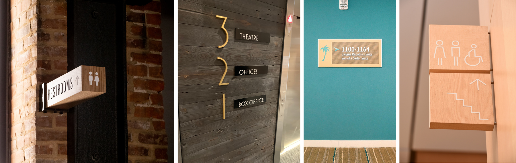
Sign Type Selection: There are countless sign types to fit all facility designs and budgets. You’ll need a family of sign types that take into consideration the facility, the users, the employees, any goals, and the branding. Through a Design-Build method, you get the full bandwidth of planners, designers, manufacturers, and installers to create a sign system that fits into a proposed budget based on the size and scope of the project. Our team has all of these sign experts in-house and their goal is to help you create the right sign in the right location and right on budget.
Location, Location, Location: You have to deliver information at just the right time. Using floorplans a planner can identify the main destination areas for a business or facility and just the right amount of information needed on the signage. The sign location, codes, and placement are also analyzed to ensure guests, customers, or visitors reach their destination.
Typography: Typography is important to convey the brand. However, for wayfinding signs, it’s about readability for a positive customer experience. Planners and designers are experts at this type of sign design and provide recommendations. Important items to address include: how large does copy needs to be for legibility at needed distances, font analysis (san-serif fonts are better than serif), and justification for Wayfinding ease. And while you might think ALL CAPS is bigger, bolder, and better, it’s easier to read when someone can distinguish letters using Initial Caps because each word has an identifiable footprint. This is most important when the copy is more than one word or a phrase.
Multilingual Needs: What languages are used by visitors? Understand your audience and identify if it is one additional language or multiple languages. If multiple, universal pictograms could be the better answer. If multilingual signs are needed it is important for a translator to consult and review all sign types prior to production.
Icons, Pictograms, and Acronyms: Icons and pictograms were developed to help people understand directions and destination options quickly. There are many options these days and making sure you choose universally understood options are key. Often, companies have their own lingo, acronyms, and icons that may not make sense to the general public. Having an outside perspective to consult on selecting the right images and naming conventions is helpful to convey the best meaning.
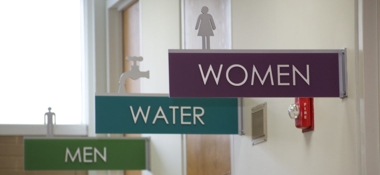
Color Conveys Meaning: We all know red means stop and green means go. Some may even know that yellow is commonly used for warnings. But when it comes to signs, there are universal colors to help. For example, a parking sign is often blue. Your signs can leverage universal color schemes that your visitors don’t even realize they intuitively know or are learning.
Have questions or ideas on Wayfinding?
Schedule a Wayfinding Lunch and Learn with your team and one of our Sign Experts.
Find an expert to learn more about the Design-Build process or any questions you might have.
Like what you see?
Get more ideas, design, and inspiration delivered to your inbox on a monthly basis. Sign up for our email, we won’t waste your time!