
Synthesis of Style and Accessibility: Dual Signs Revolutionizes ADA Signage
Dual signs give architects and interior designers the chance to be creative while maintaining ADA compliance on permanent room signage such as room numbers and signs marking restrooms and elevators.
Dual signs give architects and interior designers the chance to be creative while maintaining ADA compliance on permanent room signage such as room numbers and signs marking restrooms and elevators.
The Importance of ADA Compliance for Signage
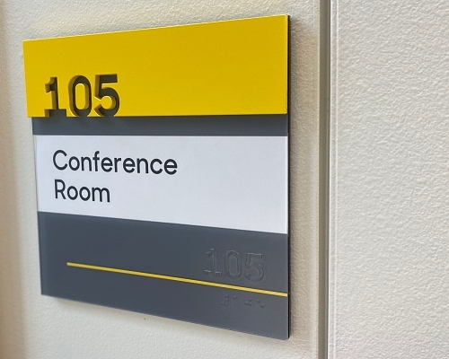
ADA’s federal legislation helps people of all abilities have access, including clear interpretation of essential signs. These laws also impose strict rules around the fonts, size, color and more considerations in sign design:
- Visual and tactile characters are required.
- The characters must be raised to a certain depth.
- Braille characters must be placed directly below the corresponding text.
- Characters must visually contrast with their background.
- Neither the characters nor the background can have any surface glare.
There are even specific rules for where an ADA-compliant sign can be placed on a wall. Businesses that do not comply with ADA guidelines can face legal and financial penalties, so it’s crucial that building signage is carefully designed and fabricated with ADA guidelines in mind.
This used to mean permanent room signage was largely standard…and a little boring. Whether you were in a hospital or hotel, room numbers and other signs mostly looked the same, and nothing stood out.
Dual signs change all that, putting the primary focus back on creativity.
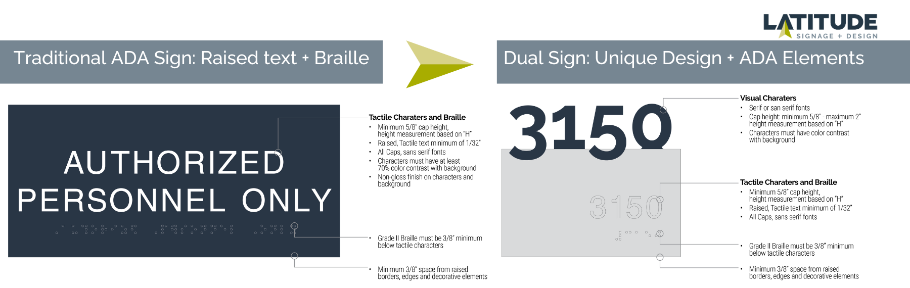
Bringing Creativity Back to ADA Signage
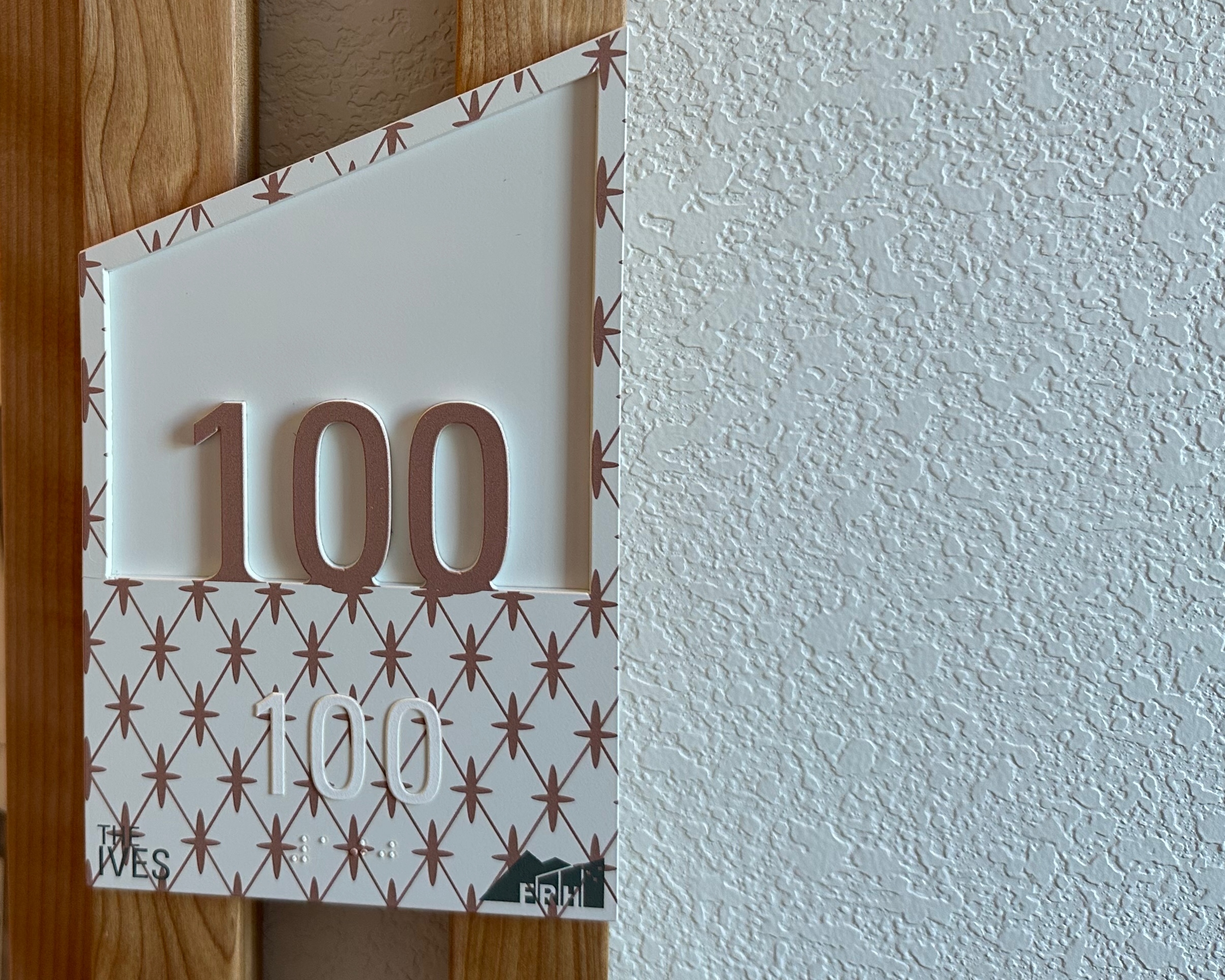
Dual signs essentially break a sign into two parts: What you see or notice and what a sight-impaired person can read.
- The visual part of the sign allows for more creativity — decorative fonts, bright colors, and upper- and lowercase letters are all acceptable.
- The other part of the sign is the ADA-compliant portion, with raised letters and Braille included.
The dual sign approach meets ADA guidelines because the raised letters and Braille are still included. That portion of the sign could even be designed to blend in with a background color or pattern to enhance your sign’s visual appeal further.
After all, fire route signs, room numbers, and stairway markers are meant to be seen. Using colors, patterns, and textures can draw more attention to these critical signs.
When you choose dual signage for your building, you can ensure your creative vision will come through in every aspect of its design. While permanent room signage might seem like a small piece of the puzzle, when you see all these pieces together in one place, you see just how far they go in creating an experience for every person who visits your building.
Want to know more? Connect Today!
Like what you see?
Get more ideas, design, and inspiration delivered to your inbox on a monthly basis. Sign up for our email, we won’t waste your time!