Signage Color Psychology: The Science of Visual Perception
Summary: In architectural signage, color is more than an aesthetic choice; it is a physiological trigger. Effective signage leverages color theory to influence visitor behavior, improve wayfinding legibility, and reinforce brand trust. By applying technical standards like Light Reflectance Value (LRV), businesses can ensure their environmental graphics are both high-impact and ADA-compliant.
Color Theory in Business Signage
First impressions are everything in business. Before a visitor, customer, client, or prospective employee enters your building, they encounter your signage. But did you know that your sign’s color palette can subtly yet powerfully influence their perception of your brand?
This is the fascinating world of color psychology or color theory, which explores how different colors evoke specific emotions, associations, and physiological responses. For businesses, understanding this phenomenon is crucial for crafting effective signage that connects with your target audience and drives results.
Why Does Color Matter in Signage?
While we often think of color purely in an aesthetic sense, our brains are wired to react to it in deep-seated, instinctual ways. Colors can:
Attract attention: A bold, contrasting color combination can instantly pull eyes toward your sign.
Build brand identity: Specific colors become synonymous with certain brands (think of Coca-Cola’s iconic red).
Convey emotion: Colors have the power to evoke feelings of warmth, excitement, calmness, reliability, and more.
Guide behavior: Different colors can influence whether someone feels comfortable, rushed, or intrigued in your space.
Enhance legibility: The right contrast between background and text color makes your message easy to read from a distance, which is especially important for exterior signage that may need to be viewed from busy roads. Illumination is also important to consider in legibility and color selection. Learn more about how colors look when illuminated against the night sky.
Color Theory in Business Signage
Here’s how common colors influence human perception and what they communicate to visitors.
Color | Psychological Trigger | Ideal Industry | Impact on Visitor |
Blue | Trust, stability, logic | Finance, tech, healthcare | Creates a sense of security and professionalism. |
Red | Urgency, energy, action | Retail, high-power corporate | Commands immediate attention and makes an authoritative statement. |
Green | Balance, growth, health, luck | Wellness, public parks, libraries | Evokes a natural, refreshing, and harmonizing vibe. |
Yellow | Optimism, cheer, clarity | Creative hubs, education | Stimulates mental activity; best used for friendly accents. |
Black | Power, luxury, modernity | High-end retail, law firms | Portrays sophistication and sleek minimalism. |
White | Purity, precision, cleanliness | Tech, healthcare | Communicates spaciousness and sophistication. |
3 Ways We Use Color Psychology to Design High-Impact Signage
Our designers use color psychology to build ambience within a space. Here are 3 factors we take into consideration as we select colors for signage:
1. Brand Identity
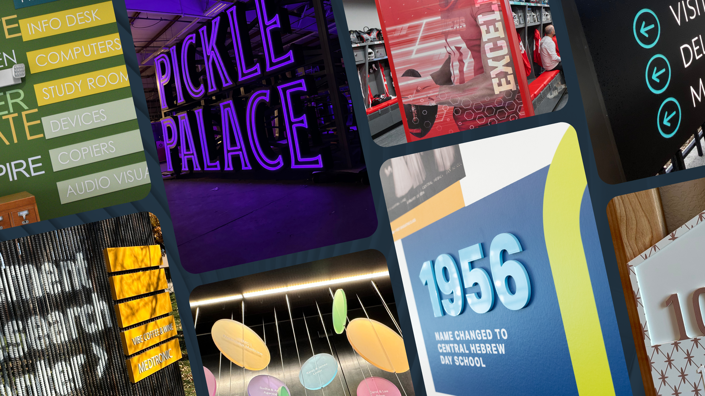
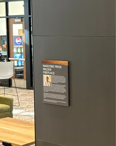
Signage must be a physical extension and cohesive part of your brand story. We help you select colors that reinforce your brand’s values, mission, and personality. At Beatrice Public Schools, we pulled existing textures and tones from the architecture to create a cohesive donor recognition display that felt built in rather than added on.

2. Target Audience
Color perception varies by age and culture. A bright, modern red might appeal to a younger audience, while an older demographic might prefer a more subdued and traditional red. We consider the age, culture, and interests of the people who most frequently use your space. At April Sampson Cancer Center, we used soft, neutral colors that would evoke feelings of serenity and healing.
3. Contrast and Legibility
For ADA-compliant signage, there should be a minimum 70% Light Reflectance Value (LRV) contrast between the text and the background. This ensures that individuals with visual impairments can safely navigate a space.
- High-Contrast Classics: Black on white or white on navy blue.
- Complementary Contrast: Utilizing colors from opposite sides of the color wheel (e.g., blue and orange).
- Pro Tip: When designing for the night sky, illumination changes how colors are perceived. Darker blues may disappear without proper halo-lighting, while whites and yellows expand.
For Northwest College, we used direct digital printing on wood patterns to maintain a warm, natural aesthetic while still achieving the high-contrast LRV required for ADA room identification. Read more about ADA requirements for color on signage.
3 Key Takeaways for High-Impact Signage
Your signage is more than just a place marker or an information display. It’s an opportunity to make an immediate and powerful emotional connection with your audience. By harnessing the power of color psychology, you can transform your signage from simple information into an effective marketing tool. Keep in mind:
- Contrast is King: Always prioritize the 70% LRV rule for accessibility.
- Context Matters: A color that works in a park may be overstimulating in a hospital.
- Illumination Affects Palette: Test your colors under both daylight and LED conditions.
Have questions on color or visibility? Let’s connect!
More to explore:
Like what you see?
Get more ideas, design, and inspiration delivered to your inbox on a monthly basis. Sign up for our email, we won’t waste your time!