High School Rebrand + Athletic Addition: Signage to Inspire the Future at Mason City High School
This project has helped our school become the benchmark standard for new facilities looking to provide an all-around, first-class experience for all that come through.
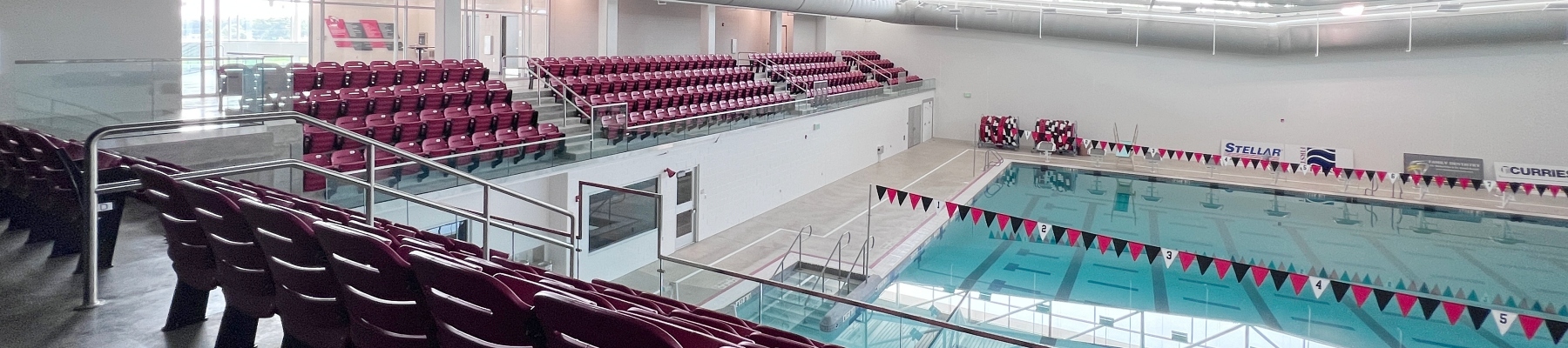
Every student athlete dreams of making that last-second shot to secure their team’s destiny as state champions and the newly rebranded “Riverhawks” of Mason City have a rich legacy of winning state championships, dating all the way back to 1918. To honor their school’s history and to facilitate future success, the community raised funds to build a new fieldhouse, weight room, and natatorium for the high school.
These state-of-the-art training facilities deserve innovative donor wall signage to recognize the many community leaders dedicated to supporting Mason City’s legacy. We were honored to partner with the Mason City High School, Bergland & Cram architectural firm, and community fundraising leaders to collaborate on a design-build approach to create custom signage solutions that take school spirit to the next level.
Custom Donor Wall Takes Flight
I think the client was expecting a more traditional approach when it came to donor recognition and they were quite astounded when the concepts were presented. It’s always fun to exceed expectations.
One of the most eye-catching signs in this project is the main donor wall. Inspired by the mascot, the donor wall looks like a riverhawk in flight. “There’s so much movement in the design of the donor wall,” says Tony Squire, Business Development Manager. “Some panels look like feathers on an outstretched wing, and the wave pattern on the panels gives the feel of a flowing river. It’s really an awesome sight.”
Andrej Steinbergs, Experiential Graphic Designer at Latitude, created all of the designs and shares, “Riverhawks are a majestic bird of prey, amazing aerialists, and capable of reaching great speeds. I wanted to convey this speed and the grandeur of the bird in motion so the bird's wings became a focal point and the canvas for the placement of inspirational quotes and donor name hierarchy. The design suggested the momentum of the bird in flight giving the impression of motion and swiftness. I think the client was expecting a more traditional approach when it came to donor recognition and they were quite astounded when the concepts were presented. It’s always fun to exceed expectations.”
The panels of the donor wall are made with MDF covered in Chemetal laminate to give it that undulating wave design. Donor names are printed on the back of clear acrylic and attached to the laminate. This design solution makes it easy to update the donor wall if there are additional donor names to add over time, and it protects the sign from vandalism.
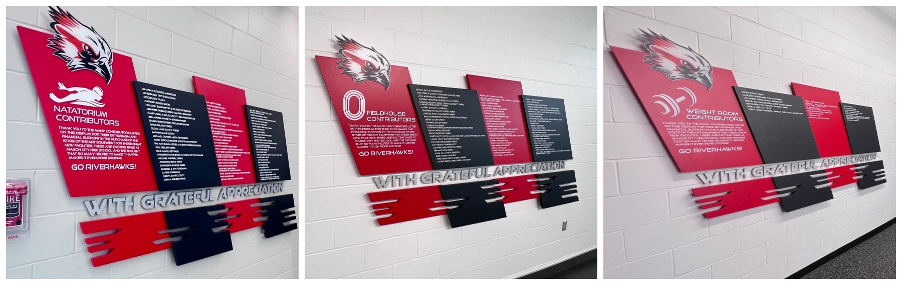
There are three more donors walls within the project, as some donors contributed funds directly to the weight room project, the fieldhouse, or the natatorium building. In all of these locations, the donor walls are made of MDF with laminate in alternating red and black panels. The panels were designed at an angle and with feather-shaped cutouts that complement the movement of the main donor wall. On these signs, the names are printed directly on the laminate.
Illuminated Channel Letters Make a Big Impact
As you walk into the new facilities, we produced several logo and branding signage pieces. The words “Mason City High School” are bottom mounted and visible immediately when walking into the space. The oversized red fabricated backers have red letters that are illuminated. “This treatment makes the letters stand out in sharp contrast,” Squire says. “And when it’s dark, the red letters are illuminated from behind and create a really cool silhouette.”
Another custom exterior architectural sign is on the exterior of the Fieldhouse. It reads “Riverhawk Athletics” in large black letters with halo illumination. One of the most interesting features of this sign is the innovative installation process that made use of the building’s girt system. The letters are attached directly to the support system inside the building and all of the wiring runs through the girts, horizontal structural supports, giving the letters a seamless look inside and out.
Signage to Inspire the Future
With such modern facilities for their athletics, Mason City High School wanted the signage to also reflect their pride in the school. We knew that we had to deliver signage that would capture their school spirit and inspire students and community leaders to continue Mason City’s history of excellence.
“This project has helped our school become the benchmark standard for new facilities looking to provide an all-around, first-class experience for all that come through,” says Dan Long, Principal at Mason City High School. “Their work puts a high mark on the rich history and pride for those that have come before us and generates a level of excitement for those that are currently involved and looking to be a part of our future!”
Latitude Signage was great to work with from the very start. They take a personalized approach and work with you every step along the way to ensure your needs are met.
Have questions?
Want to talk to a sign expert about our design-build process?
Find your expert now.
RECENT CASE STUDIES
Musco Lighting: A Best-in-Class Example of Corporate Signage Systems
When Musco Lighting expanded its corporate headquarters with a new addition and major renovation, they needed a signage partner capable of balancing high-volume interior functionality with complex exterior engineering. Jacyln Taylor, CEO of Taylor REP, engaged Latitude Signage + Design as the design-build partner to bridge the gap between architectural vision and operational reality.
Like what you see?
Get more ideas, design, and inspiration delivered to your inbox on a monthly basis. Sign up for our email, we won’t waste your time!