Architectural ADA Signage: The Top 5 FAQs
Summary: The Americans with Disabilities Act (ADA) was developed to make it possible for everyone, including those with a disability, to freely access public services. It guarantees access to places of public accommodation without discrimination. The ADA is an extension of the landmark 1964 Civil Rights Act.
Navigating the complexities of the ADA for commercial facilities can be daunting. A single non-compliant sign can lead to failed building inspections, costly retrofits, or accessibility lawsuits.
To help facility managers, commercial architects, and general contractors maintain code compliance, we compiled the top five most frequently asked questions regarding ADA signage regulations and installation requirements.
FAQ 1: Which Rooms in a Commercial Facility Require ADA Signage?
A common misconception is that ADA signs are only required for restrooms or exits. According to the 2010 ADA Standards for Accessible Design (SAD), physical sign compliance is categorised by space usage.
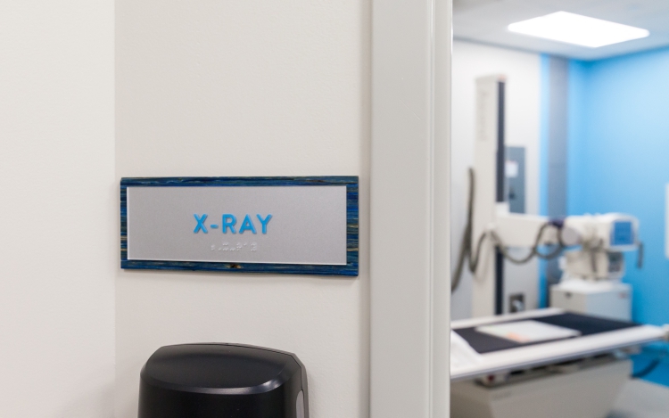
- Permanent spaces: Any room or space that is unlikely to change its primary function must have permanent, tactile ADA signage. This includes restrooms, mechanical closets, electrical rooms, kitchens, and numbered classrooms or offices.
- Directional and informational signs: Wayfinding signs directing occupants to exits, accessible entrances, or specific departments require high visual contrast and non-glare finishes, though they do not always require tactile braille unless identifying a permanent exit doorway.
- Temporary spaces: Signs identifying temporary spaces (such as a room reserved for a weekly meeting or temporary storage) are exempt from tactile ADA standards.
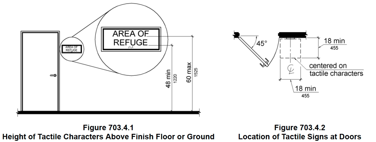
FAQ 2: What Are the Exact ADA Mounting Height and Wall Location Rules?
Signs must be installed in a specific, consistent area of the wall, alongside door openings, to be ADA compliant. The mounting height of the sign is based on the height of the tactile characters above the finished floor. The code spells out most of the mounting scenarios in specific detail, and we’re here to help you navigate those mounting requirements.
FAQ 3: Why Do We Need Tactile AND Braille Characters?
Not everyone who is sight impaired was born that way, and fewer than 10% of sight-impaired Americans can read Braille. Many people lose their sight when they are older and may never learn Braille, but they know how to recognize letters by their shape. For these people, the transition of learning to read tactile letters on a sign is much easier than learning the new coding of Braille. Therefore, BOTH tactile and Braille are key elements of accessible signage.
To be fully compliant with the ADA, braille must be tactile and follow these tactile graphic requirements:
- Grade 2 Braille: All ADA-compliant signage in the United States must utilize Grade 2 Braille. This is a contracted form of braille that uses shorthand combinations rather than a letter-by-letter translation (Grade 1).
- Shape and profile: Braille dots must have a rounded, dome-shaped profile. Flat-topped or pointed dots are non-compliant and difficult to read.
- Placement: Braille text must be positioned directly below its corresponding raised print text. If the text wraps to multiple lines, the braille must sit below the entire block of text, separated by at least ⅜”.
FAQ 4: Do ADA Signs Need to Be Made of Specific Materials or Colors?
The ADA standards do not mandate specific materials. You can use wood, acrylic, metal, stone, or high-performance composites, provided they meet these finish and contrast rules:
- Non-glare finish: The substrate and characters must have a matte, eggshell, or other non-glare finish. Glossy, highly reflective surfaces are prohibited because glare makes characters unreadable for individuals with low vision.
- High color contrast ratio: While the ADA does not specify an exact mathematical contrast percentage (e.g., “70% contrast”), it mandates that characters must contrast sharply with their background (either light characters on a dark field or dark characters on a light field). This contrast is key for anyone with limited or deteriorating sight. It goes a long way in helping people be self-sufficient in public areas, and it makes your signage much more functional.
- High contrast workaround: The current version of the ADA includes a section on dual signs, which allow for the text and background color to be the same. In this approach, the raised text and Braille must be accompanied with visual text on the sign (the visual text is less confined in its presentation on a sign). Refer to 703.1 of the ADA for complete details.
FAQ 5: What Is the Difference Between Visual and Tactile Signage?
There are two types of symbols to consider on this question.
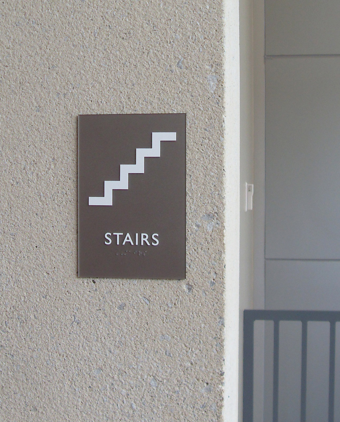
- Male/female and stair symbols are most commonly used for restroom and stairwell identification signage. ADA does not require these symbols be included. It only provides specifications about how they must be displayed if you choose to include them on your sign.
- The universal symbol of accessibility is the second type of symbol to consider. This symbol is required to be posted in a variety of ways, but the primary question comes into play with restroom identification signage. In this case, ADA only requires the accessibility symbol to be displayed at a restroom entrance if not all restrooms within a facility are accessible.
- Note: All new construction now requires that all restrooms are accessible. Therefore, in a newer facility it is assumed that a restroom is accessible and does not need to be identified as such.
Is Your Facility Fully Compliant?
Designing, fabricating, and installing code-compliant ADA signs requires precision. Working with an experienced sign partner ensures your building meets federal standards while matching your brand’s unique architectural aesthetic.
Reach out to us directly at connect@latitudesignage.com to consult with our compliance team.
Like what you see?
Get more ideas, design, and inspiration delivered to your inbox on a monthly basis. Sign up for our email, we won’t waste your time!