LRV Calculator for ADA Signage: How to Measure Color Contrast
Summary: Learn how to calculate color contrast for ADA-compliant signage using Light Reflectance Value (LRV). While a 70% LRV contrast between text and background is the industry standard for optimal legibility, slight variations can still be compliant. Use the provided LRV mathematical formula and standard manufacturer paint swatches to ensure regulatory accessibility.
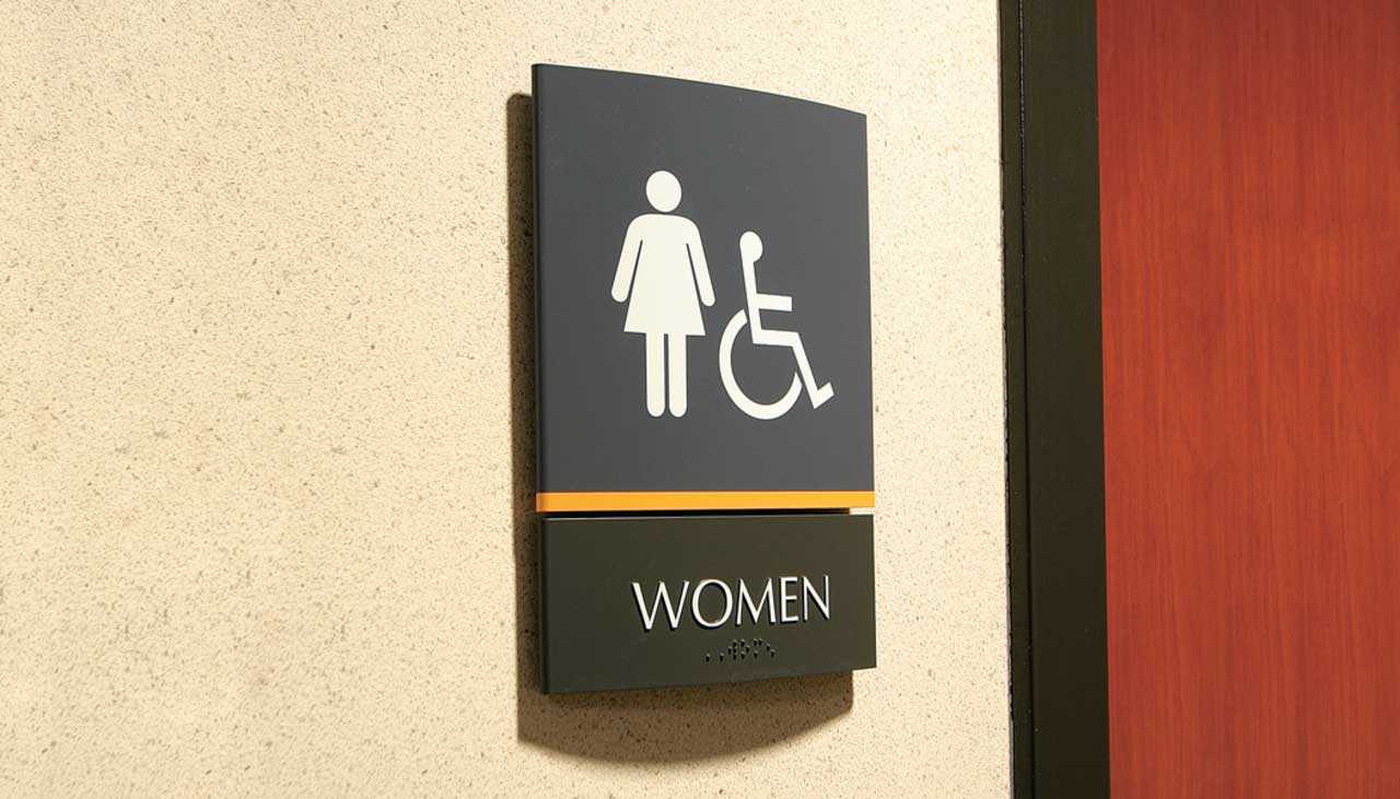
When designing accessible spaces, ensuring your indoor and outdoor directional signs are easy to read is a best practice and often a legal requirement. Under the Americans with Disabilities Act (ADA) and local building codes, achieving the right color contrast is essential for visual clarity.
Here is a breakdown of how Light Reflectance Value (LRV) works, how to use the LRV contrast formula, and how to ensure your signage meets regulatory standards.
What is the 70% LRV Contrast Rule?
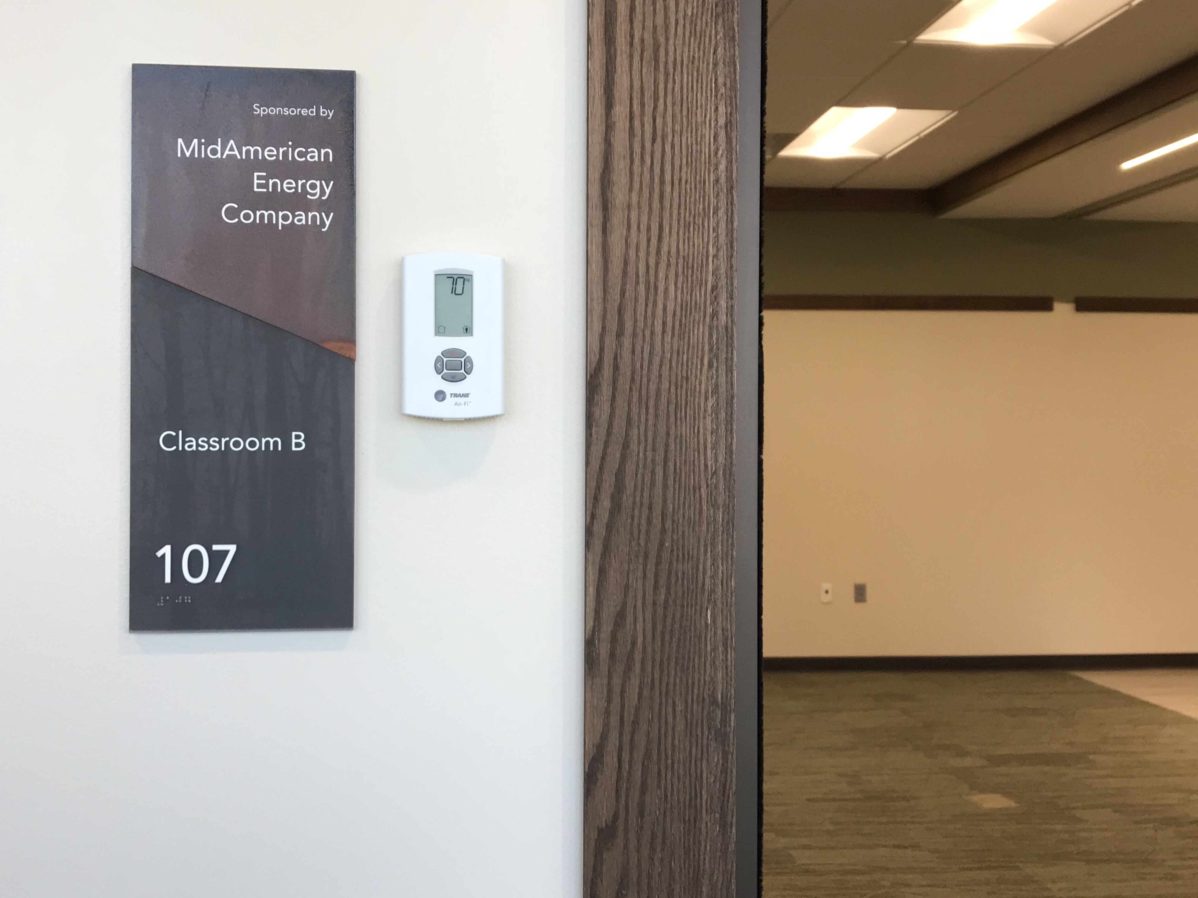
As an industry rule of thumb, a 70% LRV contrast between sign text and its background color is the ideal guideline to follow when evaluating design and finish options.
- Where to find LRV data: Most major commercial paint manufacturers include LRV numbers for their colors in their swatch books.
- Our standards: LRV values for all paint finishes in our standard ranges, along with pre-calculated contrast breakdowns, can be found in our official Standard Color Documentation.
Our LRV Contrast Formula
To manually calculate whether your chosen color combination meets ADA guidelines, use the standard mathematical formula for light reflectance:
Contrast = ( B1 — B2) x 100 / B1
B1 = LRV of the lighter area
B2 = LRV of the darker area
Example: If your background color has an LRV of 80 (B1) and your text color has an LRV of 20 (B2), the calculation is:
(80 — 20) x 100⁄80 = 75% contrast. This combination comfortably passes the 70% benchmark.
Is 70% a Strict Legal Requirement?
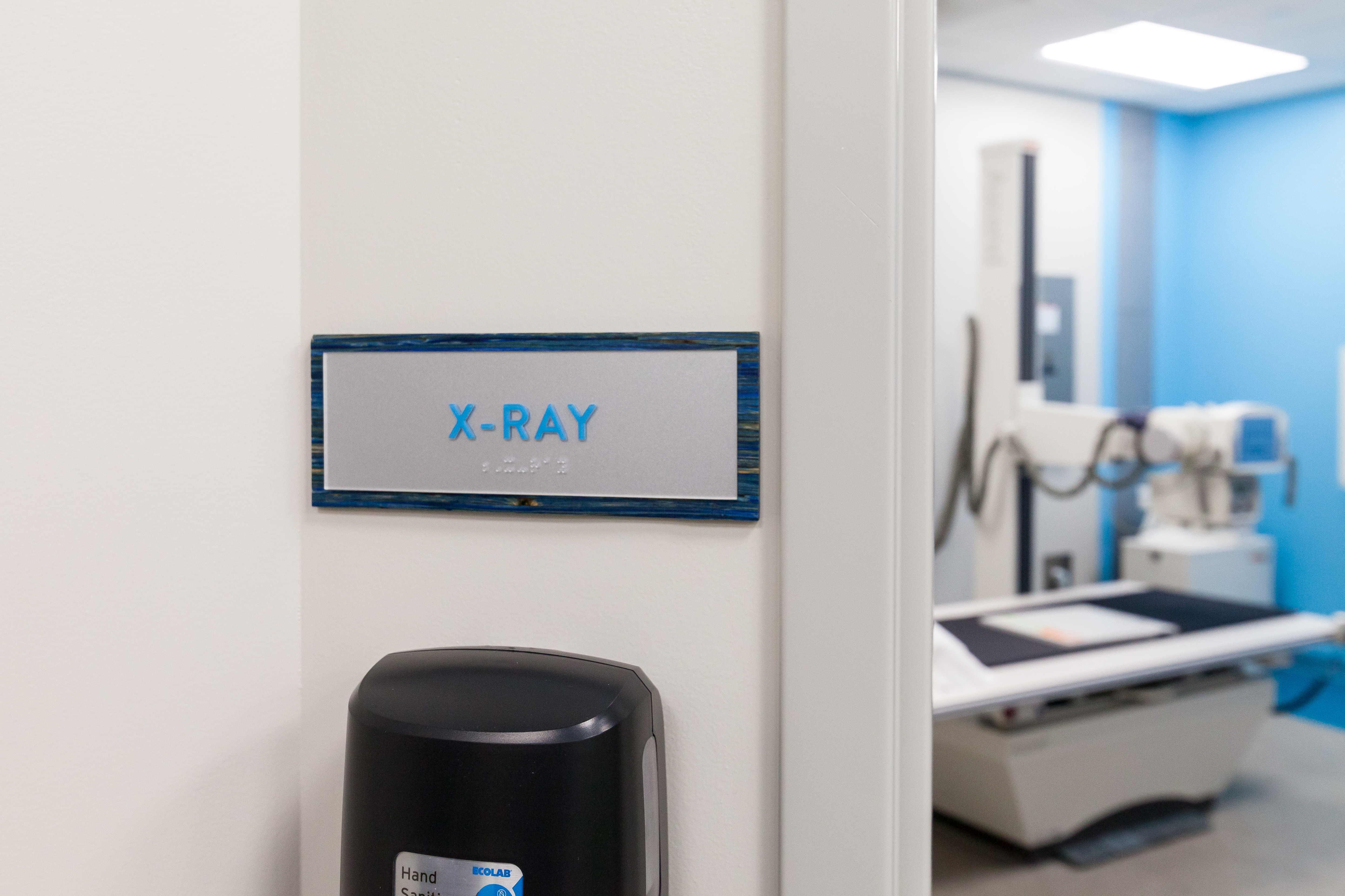
Our experience in architectural signage has shown that the 70% figure is not always a magic number.
Depending on the specific hues, lighting conditions, and finish textures chosen, contrasts a few percentage points below the recommended 70% threshold can still yield highly legible, compliant results. However, aiming for the 70% target is the safest way to ensure your facility’s signage remains universally accessible and compliant with regional accessibility inspectors.
Need Help Calculating Your Sign Contrast?
Contact our team today to talk color selections.
Like what you see?
Get more ideas, design, and inspiration delivered to your inbox on a monthly basis. Sign up for our email, we won’t waste your time!