Beyond the Color: The Psychology and Science Behind Your Sign’s Colors
First impressions are everything in business. Before a visitor, customer, client, or prospective employee enters your building, they encounter your signage. But did you know that your sign’s color palette can subtly yet powerfully influence their perception of your brand?
This is the fascinating world of color psychology or color theory, which explores how different colors evoke specific emotions, associations, and physiological responses. For businesses, understanding this phenomenon is crucial for crafting effective signage that connects with your target audience and drives results.
Why Does Color Matter in Signage?
While we often think of color purely in an aesthetic sense, our brains are wired to react to it in deep-seated, instinctual ways. Colors can:
Attract attention: A bold, contrasting color combination can instantly pull eyes toward your sign.
Build brand identity: Specific colors become synonymous with certain brands (think of Coca-Cola's iconic red).
Convey emotion: Colors have the power to evoke feelings of warmth, excitement, calmness, reliability, and more.
Guide behavior: Different colors can influence whether someone feels comfortable, rushed, or intrigued in your space.
Enhance legibility: The right contrast between background and text color makes your message easy to read from a distance, which is especially important for exterior signage that may need to be viewed from busy roads. Illumination is also important to consider in legibility and color selection. Learn more about how colors look when illuminated against the night sky.
Color Theory in Business Signage
Here’s how some common colors influence human perception and what they communicate to visitors:
Red: The Color of Urgency and Energy
Red is a vibrant, attention-grabbing color that's hard to ignore. It’s associated with: energy, passion and excitement. Red can make a strong, authoritative statement in your space and is a common color in high-powered business industries.
Blue: The Color of Trust and Dependability
Blue is a go-to color in financial, technology, and healthcare industries because it is associated with calmness, stability, and reliability. Blue creates a feeling of security and professionalism. It’s great for office environments or places where logical thinking is required.
Green: The Color of Nature and Balance
Green evokes a natural, refreshing, and harmonizing feeling. It symbolizes nature, health, and freshness and is often associated with money, prosperity, and luck. Green creates a sense of balance and calm, making it suitable for health and wellness environments, as well as office spaces and public areas such as libraries and parks.
Yellow: The Color of Optimism and Happiness
Yellow is a bright, cheerful color that also draws attention. Associated with happiness, positivity, and cheerfulness, yellow can stimulate mental activity and create a sense of optimism. Yellow is often used to bring a fun, friendly approach to a space and should be used carefully — too much of the color can be visually overwhelming.
Black: The Color of Power and Luxury
Black is a sophisticated and formal color that portrays a sense of power, elegance, and luxury. It works well in minimalist designs, adding to the feel of simplicity and modernity. It works best as an accent or for high-contrast text and can make a bold statement when used correctly.
White: The Color of Cleanliness and Minimalist Design
White provides a clean, neutral background and can stand on its own for a modern look. White spaces evoke feelings of freshness, cleanliness, and simplicity. Healthcare and technology companies use white to communicate spaciousness and sophistication. It’s also a great contrasting color for signs to ensure legibility.
How We Use Color Psychology to Design High-Impact Signage
Our designers use color psychology to build ambience within a space. Here are 3 factors we take into consideration as we select colors for signage:
1. Brand Identity
Obviously, your brand is the most important thing we keep in mind as we design signage packages. Your signage should be a cohesive part of your overall brand story, so your logo, website, marketing materials, and signs should all work together to create a unified brand experience. We help you select colors that reinforce your brand's values, mission, and personality. In the example below, designers used colors and textures already existing in the space to inspire a fun, cohesive donor recognition display at Beatrice Public Schools.
2. Target Audience
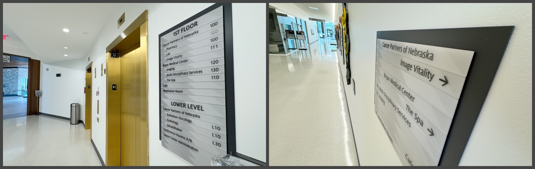
The same color can evoke different feelings for different demographics. A bright, modern red might appeal to a younger audience, while an older demographic might prefer a more subdued and traditional red. We consider the age, culture, and interests of the people who most frequently use your space. At April Sampson Cancer Center, we used soft, neutral colors that would evoke feelings of serenity and healing.
3. Contrast and Legibility
A sign is only effective if it can be read, and this is especially important with ADA compliant signage. We focus on using high-contrast colors for texts and backgrounds. A 70 percent Light Reflectance Value (LRV) contrast between sign text and background colors is an ideal guideline to follow when evaluating color and finish options.
The most legible combinations are:
High-contrast classics: Dark text on a light background or light text on a dark background (e.g., black on white or white on navy blue).
Color wheel pairs: Colors on opposite sides of the color wheel create the strongest contrast (e.g., blue and orange or yellow and purple).

This example shows Northwest College's ADA room signage, fabricated using a direct digitally printed wood pattern that achieved the high-contrast legibility we needed. Read more about ADA requirements for color on signage.
Make Your Colors Speak for You
Your signage is more than just a place marker or an information display. It's an opportunity to make an immediate and powerful emotional connection with your audience. By harnessing the power of color psychology, you can transform your signage from simple information into an effective marketing tool.
Have questions on color or visibility? Let's connect!
More to explore:
Like what you see?
Get more ideas, design, and inspiration delivered to your inbox on a monthly basis. Sign up for our email, we won’t waste your time!